Final Main Character Design

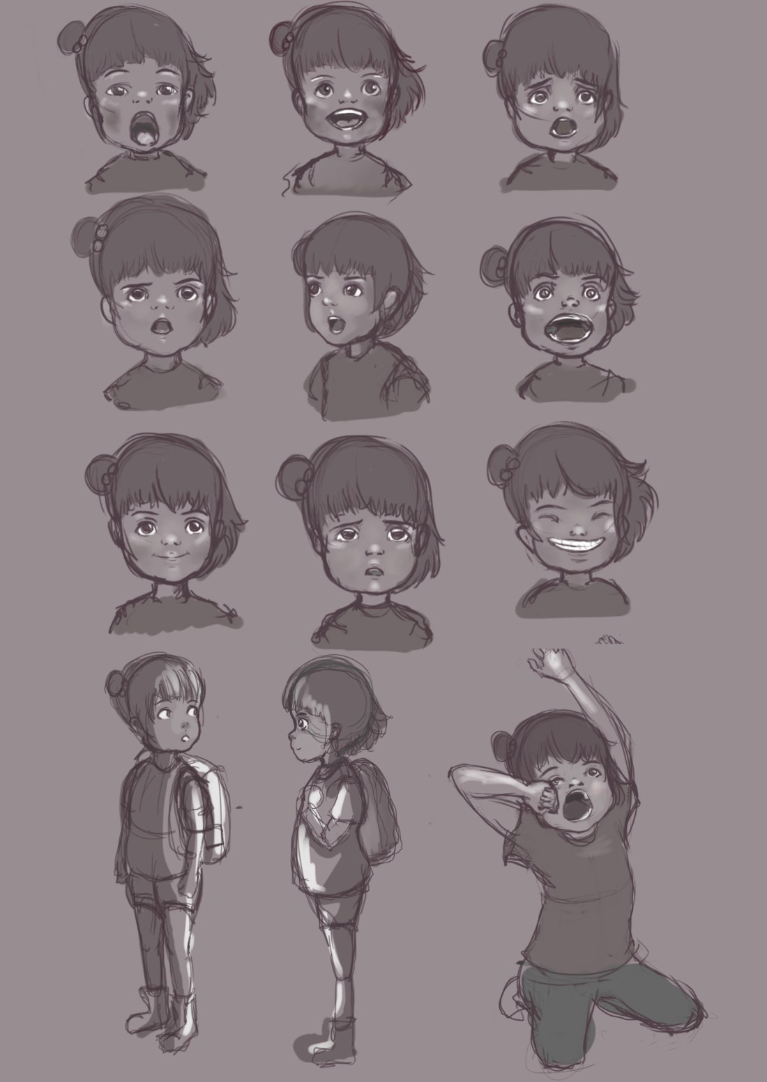
Style-wise overall I’m content with her look, I’m happy to say that this character is ready to be animated and I feel fully competent on her form and aesthetic. Similar to I guess classic anime styles I decided I didn’t want to go down a sketchy line route or anything too rough looking. For me I was drawn to the line work especially as in the past I have kept things slightly rougher and regretted it due to the motion not being as smooth or as professional looking as I would have intended originally.

new character sheet.jpg

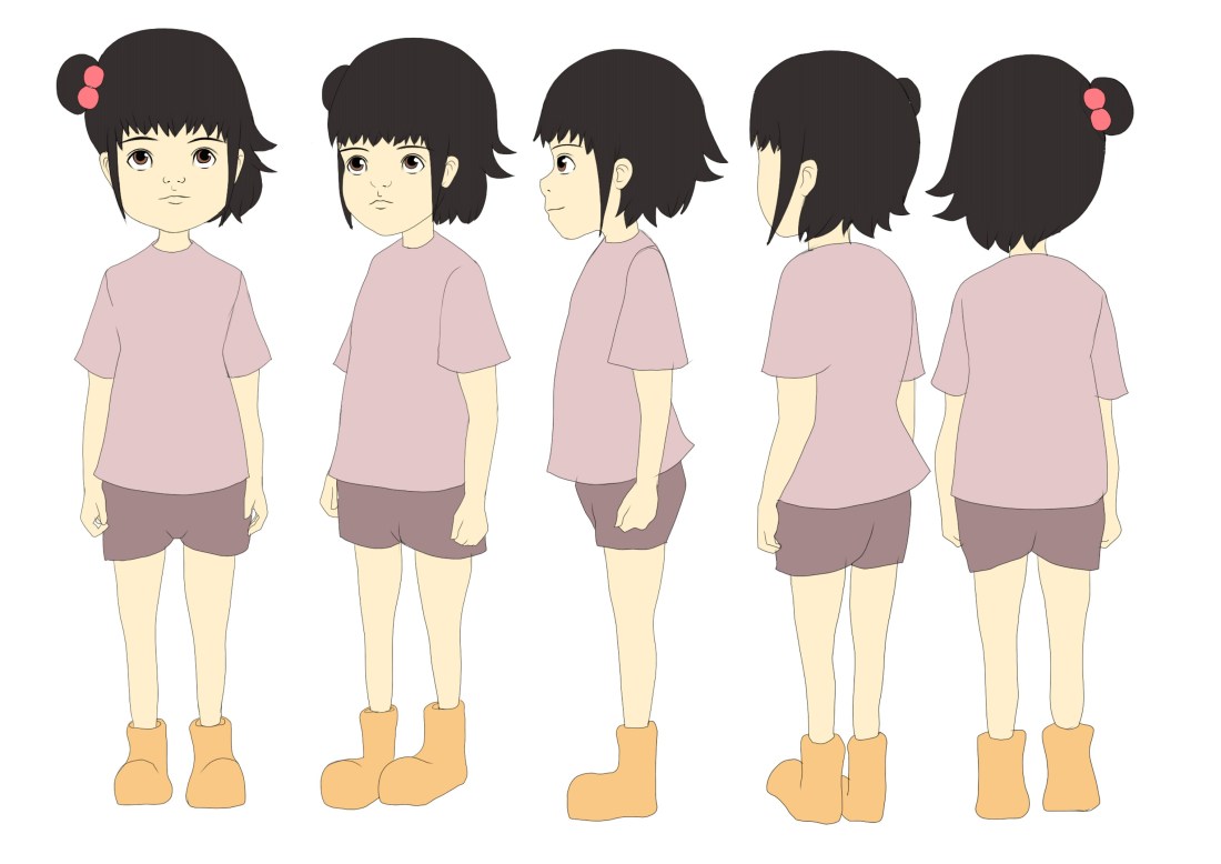
Very similar to my initial sketches, I wanted her expressions to be big and noticeable, very much like children characters from Spirited Away, Wolf Children and Ponyo. Animators tend to have this style with children where they can get away with over exaggerating areas such as the mouth or the eyes perhaps more than you could get away with in an adult character. I definitely took these charming ideas on bored when forming my character and love how expressful the possibilities can be.facial expresssions.jpg

Change of Direction ‘slightly’

Me and Hannah have both agreed that we want our animation to have more substance and meaning, we both loved the idea of being able to reflect real life horrors within our animation. The devastation that war causes is still such a terrifying calamity that we thought it would be surreal and creepy if we were an;e to bring fantasy and real life horrors into the same piece. We decided we would want to create characters to represent some of the ‘evils’ that have happened in the world. Such as WW2, comfort women of Korea, Vietnam, Auschwitz, boy soldiers and so on.

Below are our sketches when putting together ideas and concepts:

Image result for war                                                                                                                                                                                              Image result for auschwitz

Experiment with After Effects

I realised I still needed to figure out how exactly I was going to composite all of layers and animations into After Effects. I luckily found this incredible tutorial that I remembered stumbling across years ago, but at the time had no idea what the guy was saying or how to comprehend it and put it into my own work. But now, I have for sure improved on After Effects, I am by no means a master but I know enough about how it works to see me through this animation.

Heres the tutorial that I used to help me get the desired effect:

1.JPG

So to begin with, all the layers are separate PNGS, this way it is so much easier to add effects like lighting, masks and shading without it affecting another layer and making the image look strange. So I played around with masks, lighting and colour correction until I was satisfied with the final outcome.

2.JPG

Here was the first test, I composited everything into After Effects just to check how it would look. I realised that something was slightly of in regards to the perspective and it wasn’t very comfortable to look at. So this scene was completely based of my initial storyboard draw up but I soon realised it wasn’t going to work this way.

So this is my second take, which is the animation you can see me working above on in the screenshots, so here you can see a huge difference in regards to perspective, colour, shade and lighting aswell as the grass moving in the foreground and the clouds in the background.


Final Character Designs

I’m quite pleased with my final designs, yes they are I guess rather simple but that is how I envisioned them. I didn’t want characters that were over complicated and were going to be too much for me to design and then potentially animate, I wanted characters that were going to work well within the dynamics of not only my main character but my storyline and moral too.

Final Robot Design.jpg

I think these have to be some of the cutest characters’s I have designed, again I do love the simplicity and as they are so organic this leaves a lot of fun and flexibility with their movement. As they are meant to resemble ‘Spirits of the earth’ I wanted to add an effect on their looks. So after considering what route to go down, I decided that just by dropping the opacity was effective enough and was also clear for the audience to know what they are.

Final spirits design.jpg