05/11/2018 – 09/11/2018 Week 7

Research sources List:

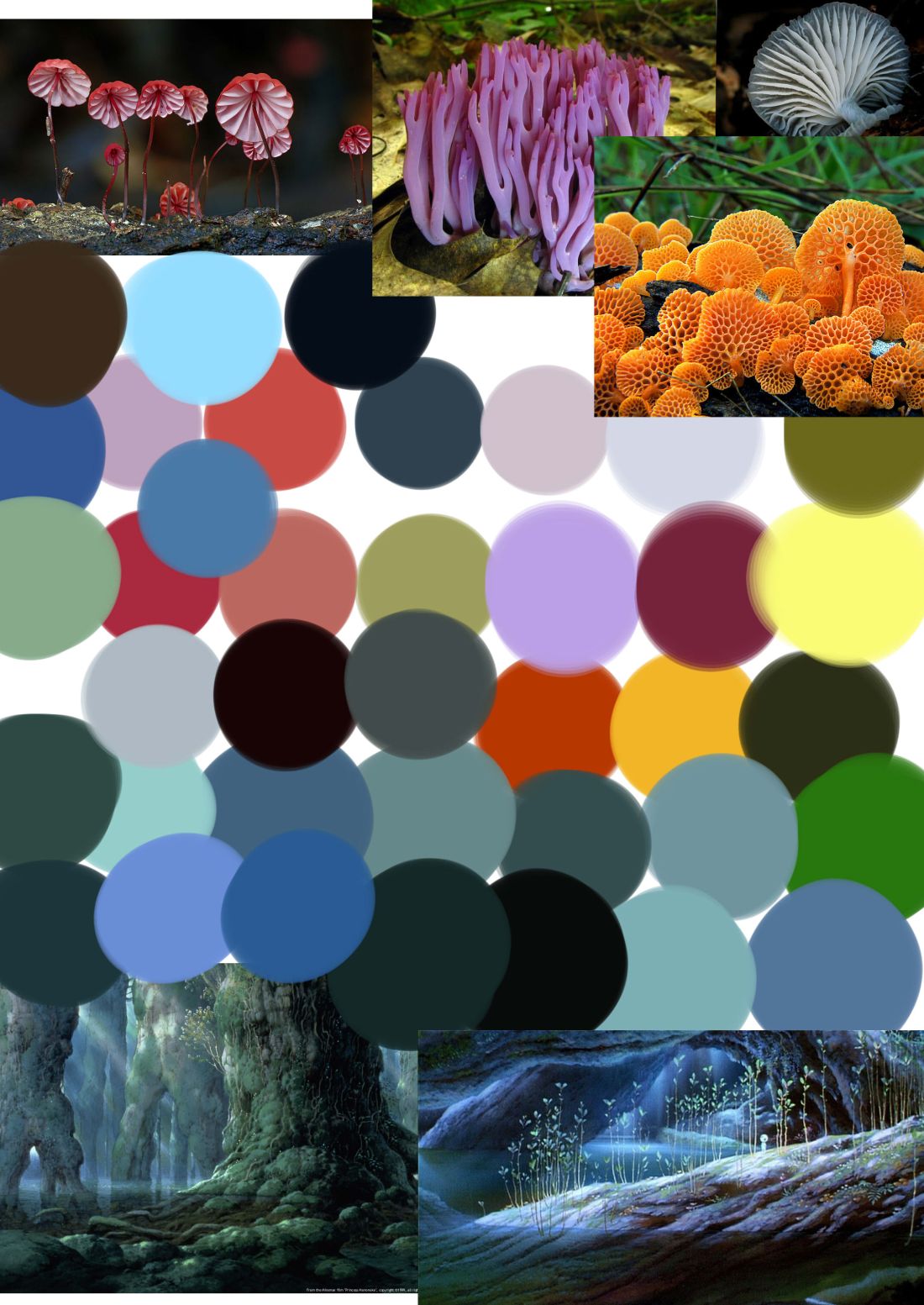
Youtube: Studio Ghibli Painting tutorials on digital software
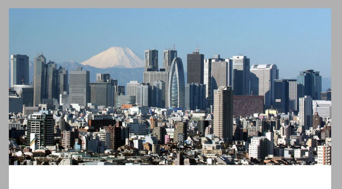
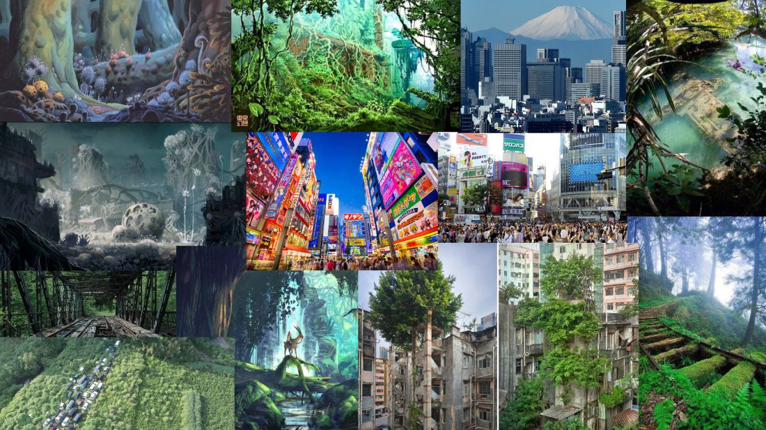
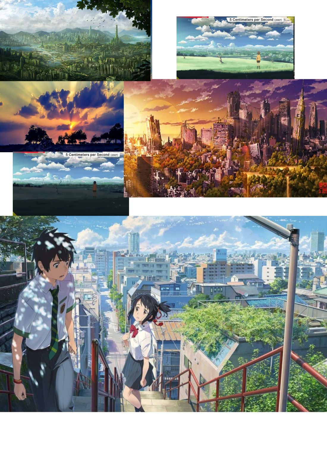
Google: Reference images for trees and organic matter
Google: Reference Images for Tokyo and city scapes
Development
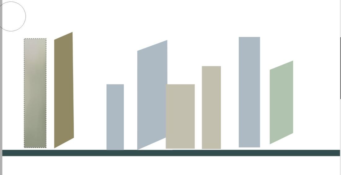
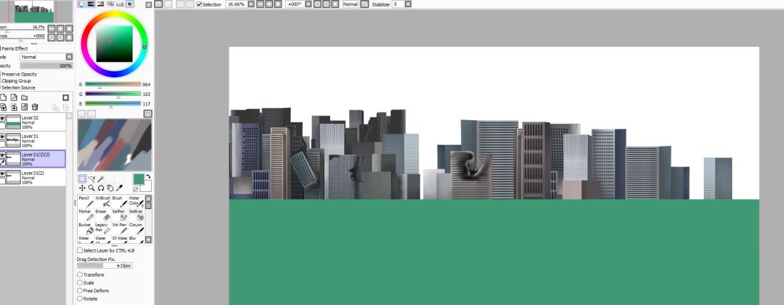
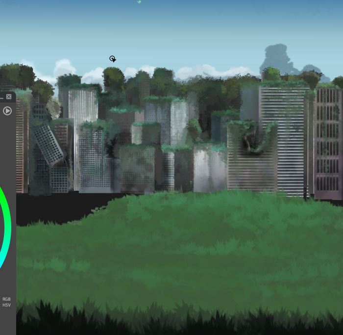
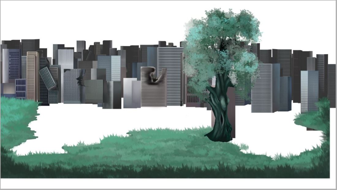
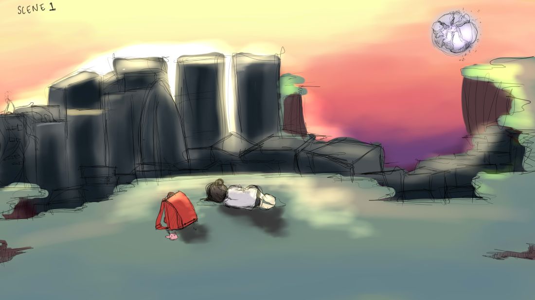
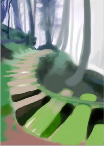
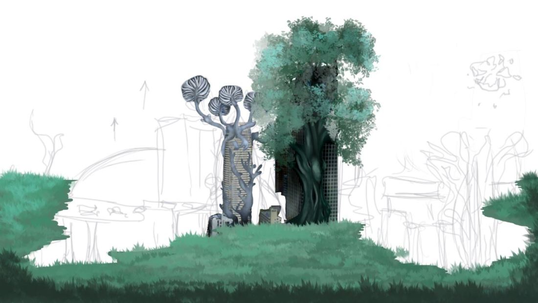
This week I’ve begun my initial designs and concepts for my background work, as this is quite a major part of my project I looked up many youtube tutorials on digital colouring, studio ghibli inspired work and lighting. Like I had stated in my project proposal I am aware that I have never really specialised or spent time developing backgrounds especially ones that are not purely organic scenary. This has been a learning curve and I have also panicked at times realising how much work these backgrounds are going to take.
Strengths
I have pushed forwards in regards to last week and managed to have a completed storyboard and started my experimentation with backgrounds which is an area that I hoped to improve on throughout the fable project. I’m happy with the progress I have made when it’s come to colours and the overall concept and feel to the backgrounds but I’m still not happy with the buildings and need to figure a way of combining the organic matter with the industrial world.
Areas for Development
Next week I plan on developing my animatic and progressing further with the project as a whole such as sound design, finalised character designs and background design.

Background Process

In order to create my backgrounds, I did initially attempt to draw the buildings but they were looking tacky and not of high quality so I felt kind of stumped on how I was going to be able to create my cityscape background. I then started watching a few youtube videos especially the ones on how anime artists create their backgrounds and I realised alot of it was tracing. A lot of the artist would trace the scenery very much like the one below but add their own style and colours to the drawing. I never considered tracing but I realised that this was going to be the most time efficient method for me to use along with the best quality of image.

p1.JPG

Here is my moodboard for colours and inspiration which I continued to refer to.

colour chart.jpg

Although using the buildings as a guideline was quicker in some respect, I did still have to make all the tiny windows and shading and layers which was still extremely time consuming.

p2.JPGyutuyguy.JPGyuoiyoyouuo.JPG

Once I had finished with all my layers and had gone in with the illuminosity and shading tools I took my image into Paintstorm where I added the foliage and the clouds to give the buildings the old and worn down apocalyptic look.

vvbbv.JPG

tutru.JPG

heres a screenshot just to demonstrate how I’ve decided to go about compositing these backgrounds. Each layer is kept separate and is converted into a PNG file where I plan to composite them all together and edit them on After Effects. This way it is so much easier to add realistic light and shadow when you can select the layers seperately.

Initial background work

Here I’ve attempted some initial background work to see what kind of colours and textures I want to create for this piece, I played around with different brush settings and software such as Paint Tool Sai and Paintstorm. I continued to reference my mood board and other inspirations throughout. What I’m figuring out now is how exactly I want to digitally paint these backgrounds s there are so many different ways of going about it.

I was not expecting backgrounds to be so tricky, not only do you have to figure out the colours and the sizing but also the perspective which i struggled with a few times.

scene one sketch and colour.jpg

r7.JPG


q9.JPG


moodboard for scenes.jpginspo.jpg