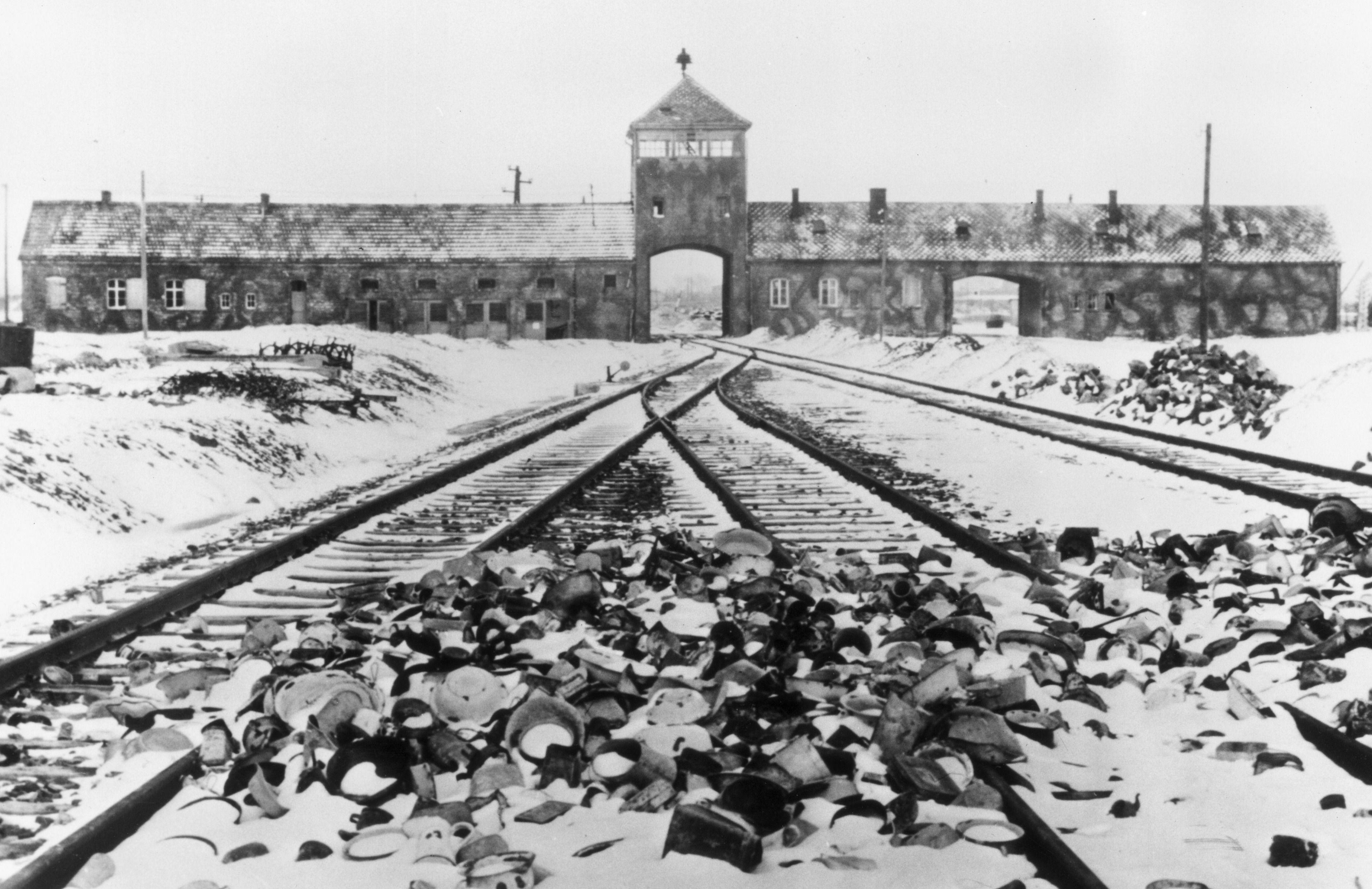
Me and Hannah have both agreed that we want our animation to have more substance and meaning, we both loved the idea of being able to reflect real life horrors within our animation. The devastation that war causes is still such a terrifying calamity that we thought it would be surreal and creepy if we were an;e to bring fantasy and real life horrors into the same piece. We decided we would want to create characters to represent some of the ‘evils’ that have happened in the world. Such as WW2, comfort women of Korea, Vietnam, Auschwitz, boy soldiers and so on.
Below are our sketches when putting together ideas and concepts:
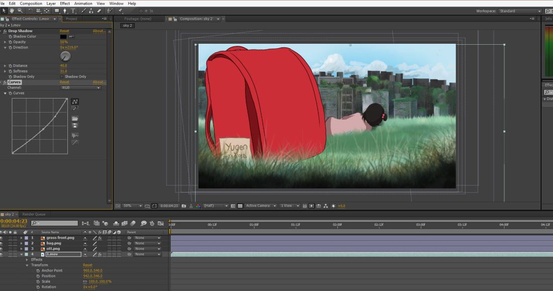
I realised I still needed to figure out how exactly I was going to composite all of layers and animations into After Effects. I luckily found this incredible tutorial that I remembered stumbling across years ago, but at the time had no idea what the guy was saying or how to comprehend it and put it into my own work. But now, I have for sure improved on After Effects, I am by no means a master but I know enough about how it works to see me through this animation.
Heres the tutorial that I used to help me get the desired effect:
So to begin with, all the layers are separate PNGS, this way it is so much easier to add effects like lighting, masks and shading without it affecting another layer and making the image look strange. So I played around with masks, lighting and colour correction until I was satisfied with the final outcome.
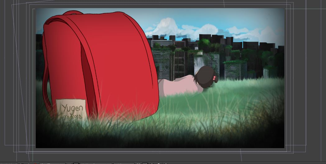
Here was the first test, I composited everything into After Effects just to check how it would look. I realised that something was slightly of in regards to the perspective and it wasn’t very comfortable to look at. So this scene was completely based of my initial storyboard draw up but I soon realised it wasn’t going to work this way.
So this is my second take, which is the animation you can see me working above on in the screenshots, so here you can see a huge difference in regards to perspective, colour, shade and lighting aswell as the grass moving in the foreground and the clouds in the background.
Fran Bow an Indie game created by a couple in Sweden took off when it came out after youtubers such as Pewdiepie, Markiplier, Daz Games and Jacksepticeye started to play the game on their channels. I discovered this game (Like little Nightmares) through these youtubers playing them. Fran Bow is one of the most creatively powerful and unique games I’ve had the pleasure of watching for a long time.
It’s games like these that really motivate me to keep trying new things with my artwork and animations and indie games is something I’ve always considered going into. Fran Bow has alot of cultural and historical references mixed with fantasy all from the perspective of a young innocent child.
Me and Hannah have come to a slight cross road where we need to figure out what we want our animation to say, yes we are aware it doesn’t have to have a fixed message but we want it to be meaningful and connect to the collective unconsciousness of our viewer.
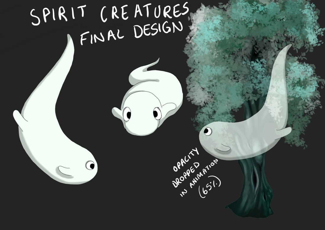
I’m quite pleased with my final designs, yes they are I guess rather simple but that is how I envisioned them. I didn’t want characters that were over complicated and were going to be too much for me to design and then potentially animate, I wanted characters that were going to work well within the dynamics of not only my main character but my storyline and moral too.
I think these have to be some of the cutest characters’s I have designed, again I do love the simplicity and as they are so organic this leaves a lot of fun and flexibility with their movement. As they are meant to resemble ‘Spirits of the earth’ I wanted to add an effect on their looks. So after considering what route to go down, I decided that just by dropping the opacity was effective enough and was also clear for the audience to know what they are.